

Model : Em Photographer : Robin Burch (Copyright 2019)
9 Top Photography Composition Rules You Need To Know
Don't Cut Off Limbs.
Understand The Rule Of Thirds.
Use Frames.
Make The Most Of Lead In Lines / Shapes.
Simplify – Know Your Focus.
Watch The Background.
Look For Symmetry/Patterns.
Create Depth.
I am self-taught. When I started taking portraiture and photographing people I watched a lot of YouTube videos, I bought magazines and I studied works by photographers I liked. I practiced a lot! I followed the rules to give my work more interest and to create better work. Using these rules of composition my work took on a better quality. I could see how they applied to an image and why the images came across well. I would structure a shoot around elements of composition such as the Rule of Thirds and then adding lead lines and then framing the subject until I was applying these basics without really thinking about it.
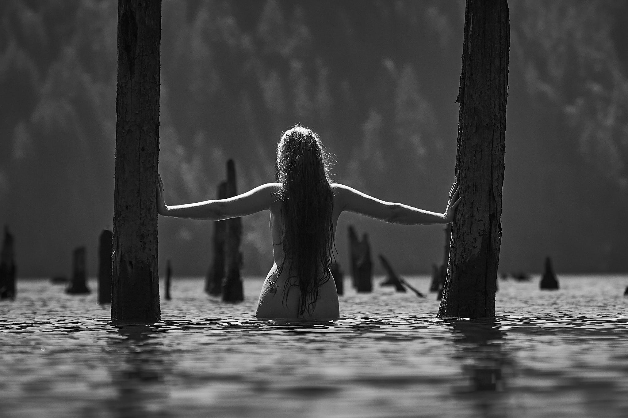
This early shot of mine typifies the use of the Rule of Thirds and geometric patterns, framing, image depth and follows the rules almost by the book.
Then, because I knew these theoretical basics, I started to notice when an image didn’t line up with them. I started to look at what made them strong images while breaking these basic rules. I started looking at other mediums and masters to figure out why the image was strong whilst not incorporating the basics of composition. It was similar to when I moved from basic chordal structures in music to jazz. However, jazz still followed a system or pattern. I was unable to conclude with any certainty why an image could break these patterns but still have visual interest. I am sure there are theorists who can answer my question but I never figured it out.
I catch myself often now when I am composing a shot or series of shots deliberately pushing the boundaries of the rules of composition. However, if the image is complicated then I still tend to fall back on tried and tested theories such as the image below.

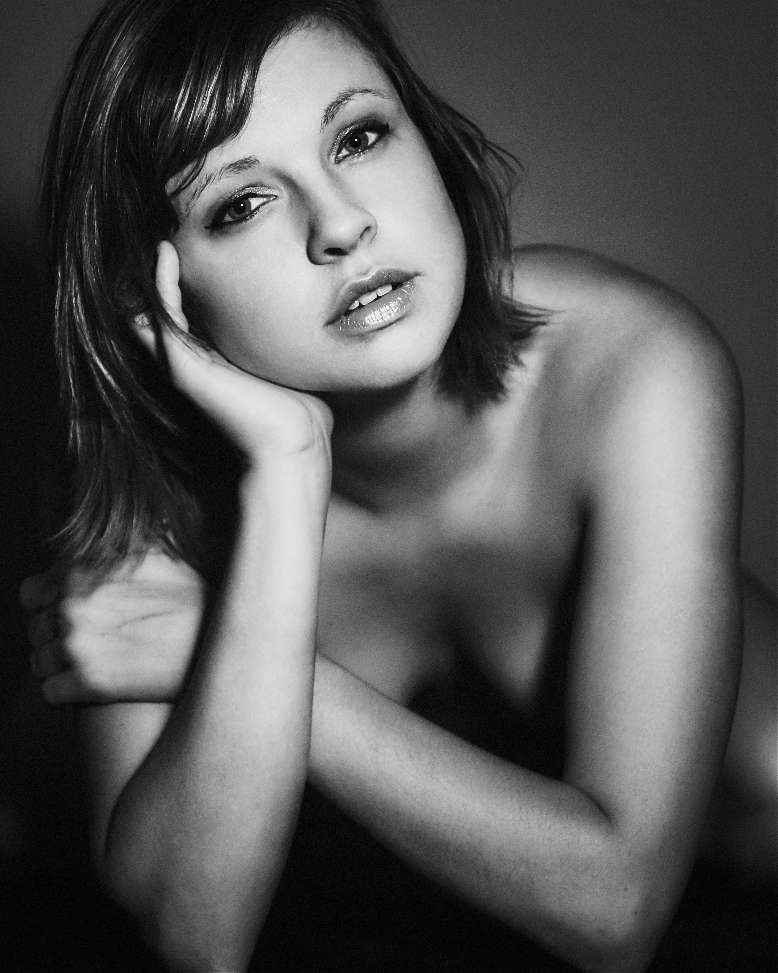
Every once in a while I come across an image that I like and I try to examine why. I released the image at the top of the page yesterday and I was perplexed because it just didn’t meet any criteria for composition rule basics. I cut off her elbows, knees and the top of her head. It doesn’t follow the rule of thirds or the Fibonacci spiral or the Golden Ratio. There is no framing, no leading lines, no real depth, a simple f4 focus and the background is minimal. Yes, I did fill the frame and the symmetry of her arms is interesting. Now, in posing guidelines we tend to avoid the back of hands but here is the flat back of her hand. We also discourage leaning the face or jaw on your hands yet here she is doing that. We can see she is wearing no top but it is an implied shot that reveals nothing. It is not sexual but there is an intimacy evident. It is posed yet it doesn’t look it.
It almost looks like a shot I would take to test the lighting or the framing yet it was part of the shoot. We were using a small light source so the light is concentrated and yes, I did crop the final edit slightly to this result. It is a 4 x 5 size rather than a Canon standard of 2 x 3. So why does it work? Maybe the lean she poses with provides a 45 degree sight line from bottom right to top left. Maybe it’s that no matter where you look you find a line that takes you to her face.
I didn’t do a lot of editing either. A bit of skin work, some sharpening of her eyes and dodge and burn. I added a very slight glow to her skin and ran it through a preset emulating an Ilford HP5 crossed with an Ilford SFX film and added a slight vignette. So it is not the edit that makes it work. How often have I worked on an edit to try and force an image to work? Yeah, I think all photographers have done that. The image should work but it’s not quite there. Maybe the edit can make it pop somehow. I did that more starting out and see that quite often. An overedited shot that just doesn’t work on a basic level.
Maybe all this breaking the rules has something to do with our expectations as a viewer. People use composition rules because they work for us as humans. We follow similar patterns with our eyes. Did you know when restaurants plan menus that they know you will usually look at the center of the page first, then the top and then the middle right? Then we drift to the top left. When you walk into a large store, ever notice the specials or seasonal products they want to sell quickly are on the right as you walk in? Yeah, there’s a science to how we look at things.
Maybe when we see an image that breaks these basic rules, we notice the asymmetry or that it doesn’t follow the pattern we are used to seeing. Maybe the way it doesn’t meet our unconscious expectations cause it to stand out. Is that what gives some famous photographers their edge? In my limited experience, images that follow the rules have a tendency to be popular and so do the images that push those limits a lot. Images that slightly nudge the rules aren’t as popular.
So, I think the saying that we must first know the rules in order to break them stands true. in order to push the boundary, we must know where the boundary is right? Otherwise we are just banging out shots and hoping they may work. Following my recent posts about what can be considered art, there exists a science. Composition, color theory, depth of field and more. Hell, just learn the Inverse Square Law if you want to see just how much science goes into our photography.
Science has rules yet art exists with much less rigidity and I think one must know at least the basics of the science to bend the rules for art. Or maybe this is like a quote describing a guitarist I love. He plays obscure tunings and is more a poet than songwriter. “Something amazing happens when you give a tool that requires knowledge into the hands of someone who doesn’t know that knowledge. They can make it their own”. His name is Chris Whitley if anyone is interested. Google “Living with the law”.
Thanks for your time and have a good one, whatever it is.